Looking for an awesome way to graph, chart, and visualize your organization’s Industrial IoT / IIoT sensor information?
We’ve added amazing, interactive graphing and charting into Tools.Valarm.net / Valarm Tools Cloud.
You’ll learn in this write-up how to use these graphs and charts to better understand and work with your remote sensor monitoring info!
 With interactive graphs on Tools.Valarm.net, you’ve got beautiful visualizations, quick overview analytics, and detection of outliers, hotspots, plus other anomalies and cool tools for your remote sensor telemetry data.
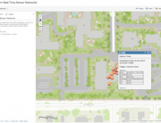
You can quickly get going with interactive charting and graphing by clicking the Device Manager tab after you’ve logged into your Tools.Valarm.net account. Click the name of your sensor hub device you want to graph, then click the Interactive Charts button on the left. The Interactive Charts button is highlighted and circled red in the Valarm Tools Cloud screenshot above.
 Before your interactive charting adventure you’ll need to set up Custom Sensor Field Renaming / Aliasing by following these here instructions if you haven’t already done it. Select your sensor field renaming set in the drop-down menu. You’ll notice that in these examples we’re using sample air quality sensor data from Alphasense OPC-N2 Optical Particle Counter sensors that measure dust and particulate matter like PM1, PM2.5, and PM10. Your organization can get the Industrial IoT sensor hardware you’ll need at Shop.Valarm.net and send us a note at Info@Valarm.net if you’ve ever got any questions.
 There’s no need for you to be timid, scared, nor afraid to click around and experiment in your Interactive Charting and Graphing window! The features are pretty self-explanatory. Click the radio buttons and types of graphs to change the different options. You’ll see towards the top left that there are 4 main types of graphs / charts you can select, choose your favorites:
- Area Charts
- Bar Charts
- Line Graphs
- Scatter Plots
 You’ll see below some of the basic features and configurations you can change. It’ll get you started and familiar so you can experiment on your own to discover what suits your tastes the most today.
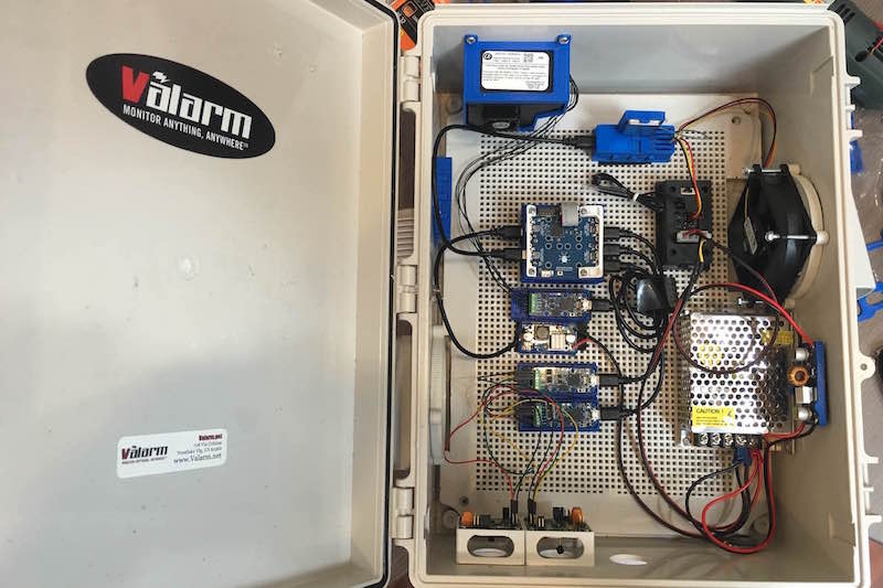
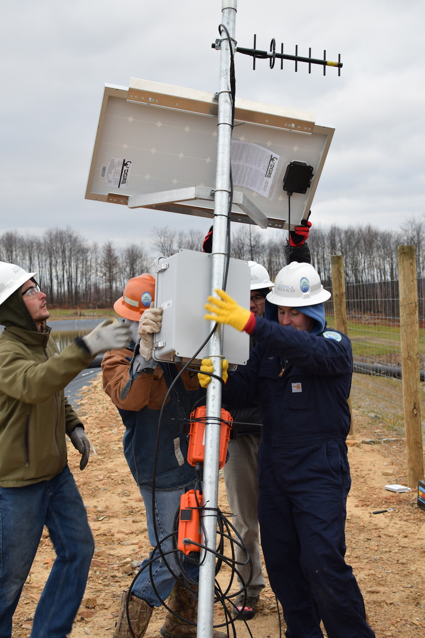
In the photo you see what the AQMD + Valarm air quality monitoring units look like that gathered the air quality sensor measurements used for the example charts and graphs in this story! You’ll see lots of graphs and charts of measurements from Alphasense OPC-N2 sensors monitoring of PM1, PM2.5, PM10 pollution and air quality.
Your standard issue line graphing. Mouse over any of your sensors to get the exact measurement values at that time stamp.

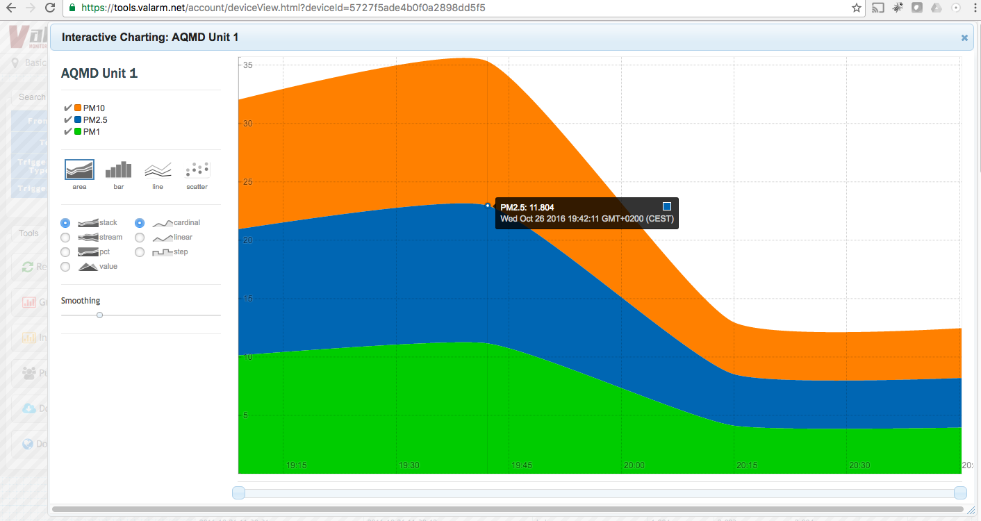
Area charting / graphing. Drag and drop your sensors in different orders to change them. Here we’ve dragged PM10 / orange to the bottom and PM1 / green to the top while leaving PM2.5 / blue in the middle sandwiched between.

Mouse over the name of 1 of your sensors to highlight just that sensor like the PM2.5 air quality sensor you see in blue in this example.

Click the name of 1 of your Industrial IoT / IIoT sensors to graph / chart just that sensor like the PM2.5 air quality sensor in this sample screenshot.

Scatter! Plots
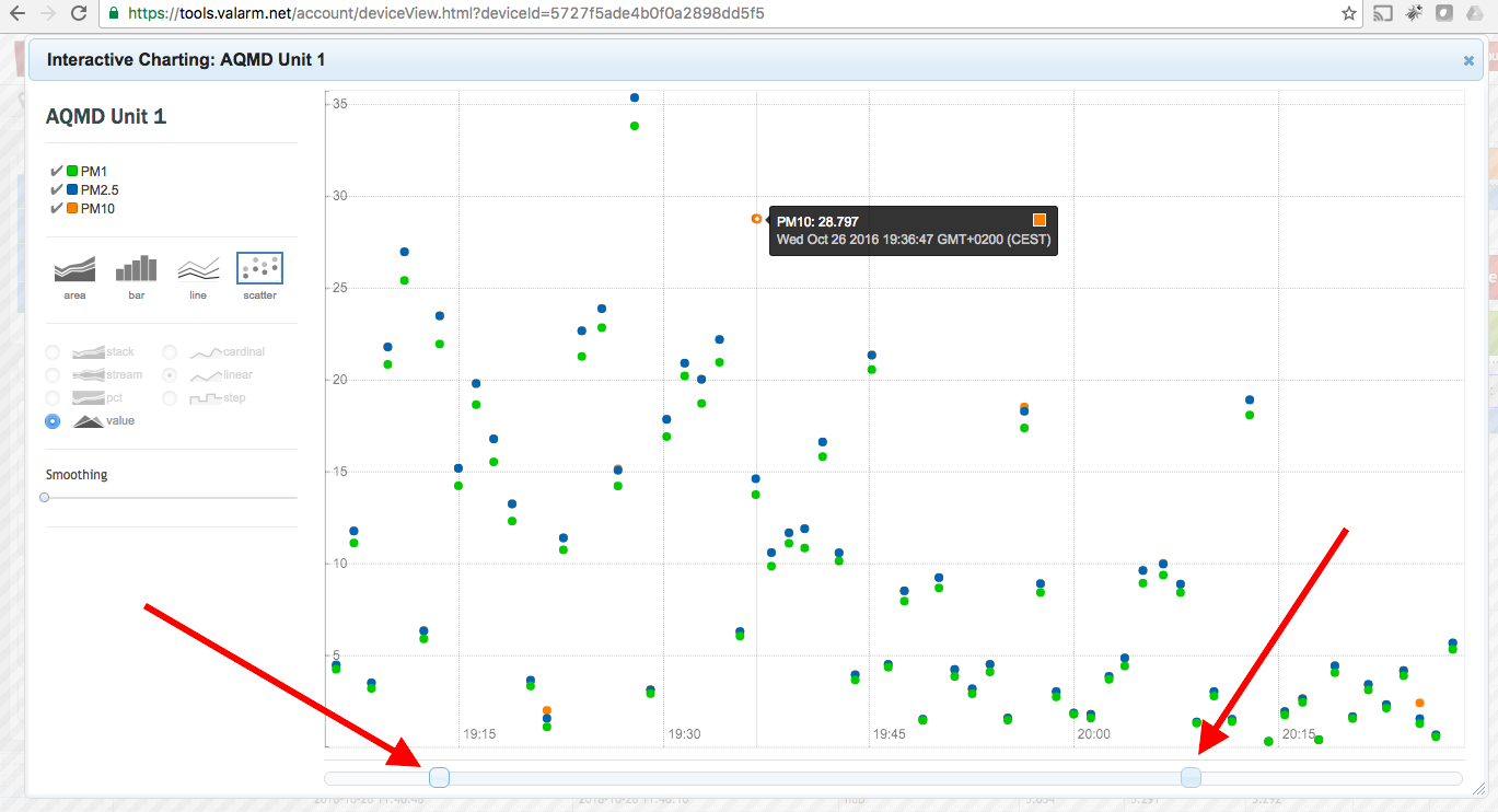
You can adjust the exact range / time interval of sensor data you’re looking at with any interactive charts. Use the force of your mouse clicking and dragging on the sliders you see the arrows pointing at.

Smooth moves in your sensor data measurements with the adjustment dial under smoothing. It’s highlighted with a bright red oval in this screenshot. Works well with all of your interactive graphs and charts!

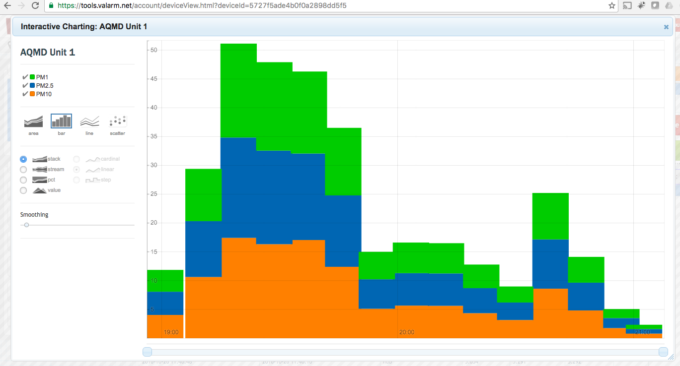
Stack those bar charts.
Change your smoothing with bar charts.
Adjust your focused time interval range with bar charts.
And change your smoothing with area and any other charts and graphs to get a quick, general idea of trends in your sensor monitoring.
What do you think? Send us a message at Info@Valarm.net and let us know.
Play and experiment to get just what you need for your Industrial IoT applications. There is also this video HowTo tutorial overview on the interactive graphs and charts on Valarm Tools Cloud.
You can use these interactive graphing + charting features with any sensors and sensor hubs compatible with Tools.Valarm.net.
 Large thank yous go out to Shutterstock for their incredible Rickshaw that makes these interactive visualizations possible!
You want to visualize your GPS-tagged, IIoT sensor info in 3D on earth globes? See here for more on how to do just that with the Esri ArcGIS 3D feature on Tools.Valarm.net.
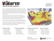
 Does your organization need custom Web Dashboards with maps, graphs, and other widgets of your industrial assets? See our Web Dashboards for Industrial IoT applications like water resources management, air quality, remote environmental monitoring, wild fire risk, tank volumes, product and chemical distribution.
Have a look at our Customer Stories page for stories on how organizations in all industries use Tools.Valarm.net for remote monitoring solutions that:
- Reduce costs
- Reduce waste
- Reduce inefficiencies
- Increase productivity
- Increase safety
 Increase real-time knowledge
We give you the power to monitor anything, anywhere, like:
- Air Quality – Specific gases like O3, NOx, H2S, SO2, dust, particulate matter like PM1, PM2.5, and PM10
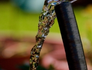
- Effective Water Resources Management – Fluids Usage & Remote Water Wells
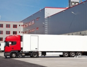
- Fleet Vehicles, Trucks, and Trailers Loaded Up With Industrial Assets Like Mobile Tanks, Pumps, and Vacuums
- Tank Volumes, Levels, and Chemical Distribution
- What does your organization need to monitor?
Questions?
Please don’t hesitate to Contact Us at Info@Valarm.net.
We’ll help you and your teams at your organization to deploy Industrial IoT / remote monitoring / sensor telemetry solutions for your needs.