How do you map, graph, analyze, and download your real-time sensor data once it’s in the Valarm Tools Cloud?
Here’s a step-by-step video tutorial on how to do that with your telemetry and remote environmental monitoring units. You’ll learn how to use one of Valarm Tools Cloud’s features: Analytical Mapping.
To learn more about Valarm visit our homepage at Valarm.net and check out the blog for more stories like how to remotely monitor water levels or water flow.

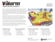
 Have a look at our web-based dashboards for remotely monitoring Industrial IoT sensors for:
Voiceover / Transcript:
Howdy, this is Edward, president of Valarm. Today you’ll see how to use Analytical Mapping on tools.valarm.net to perform powerful sensor data mapping, graphing, and analysis (you can also download your sensor data in CSV or KML format). After you have installed the Valarm app on your mobile devices you can link devices to http://tools.valarm.net, a.k.a. Valarm Tools Web, by watching our YouTube video on how to link your devices to the web.
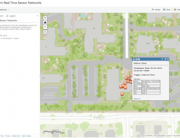
You can go to http://tools.valarm.net on any device with a web browser. We recommend using a laptop or desktop. After you’ve registered an account on http://tools.valarm.net, login and get credits using the button at the top if you don’t already have them. Click Analytical Mapping at the top and you will see a map in the middle of the page with Valarm tools on both sides of the map.
In the upper left you can select which device groups you want to show, you can customize which devices are in which groups in the Device Manager. In the devices list you see your enabled Valarm devices. Select a device and a time span to see the corresponding Valarm data. Note that you can also customize which Valarm data points are shown based on sensors and triggers such as temperature, air quality, CO2, VOCs, or the interval timer. There are also date shortcuts to quickly show only Valarm data from specific time intervals like the last week or the previous month.
As you mouse over each data point in the alert list on the left an orange placemark bounces up and down showing you where that data point is on the map. You can choose to map all of alerts in the list by using the select all checkbox or select points one at a time using the checkbox to the left of each alert. We’ll use the checkbox to the right of each alert to select all points from this session, meaning all data points between an arm and disarm of the Valarm app on the Android device.
Here you see a session where the Valarm device was in a vehicle. There is a green icon showing where the Valarm app was armed and a red icon showing where Valarm was disarmed. The blue points in between are Valarm triggers and alerts enabled on the Valarm-equipped device. In this example the accelerometer sensor and interval timer were triggering alerts. If you mouse over any alerts on the map the alert list on the left automatically jumps to where that data point is in the alert list. Click any Valarm data point to get information about it. You’ll see sensor data such as temperature, humidity, location, altitude and speed. There is also a street view image which you can click to enter street view and see your Valarm data.
To see live traffic information click the Traffic button in the upper right part of the map.
To the right of the map is the Graph All button where you can graph your sensor data. Use the checkboxes next to each sensor to see that data drawn on the graph and hold your mouse over the lines to see exact values.
Now we’ll switch which device’s data we are viewing by using the checkboxes to the left of the devices. This Valarm data was gathered on foot, walking on the coast of the Pacific Ocean. You can use the Satellite imagery button to see the land, beach, and water.
The Show Paths checkbox on the right draws a path line for the selected data. This is from the beginning of the Valarm session, the green icon showing when Valarm was armed, to the end of the Valarm session, the red icon showing when Valarm was disarmed.
The Coverage Areas tools draws a polygon around all of the data points, which can be useful to show you where devices or vehicles are overlapping in there coverage areas. This is also known as a convex hull.
The Show Accuracy tool draws red circles around each data point showing how accurate the GPS data is for that point as reported by an Android device Valarm connector. The smaller the circle the more accurate the GPS fix was for that data point.
If you have any questions, comments, or ideas for another video, please don’t hesitate to contact us.